Concept Art
Style Guide:
We are going to go for a very modern-post apocalyptic with a tinge of science fiction in our game’s art style, with the actual game looking somewhat like a blend between Slender: The Arrival, Superhot, and most apocalypse-focused games out there right now (Fallout, Wasteland etc.)
The above ground sections of the game will be decaying, with manmade structures falling to pieces and rotting away slowly over time, engulfed by mother nature as trees and nature begin to overwhelm the manmade objects.
The underground sections will be very high-tech, and will include lots of greys, blues, blacks and will be very dark. Images for character design and more will be documented as concept art is produced.
Progress update: 4th November 2020
• Yesterday, full plans, a team and our ideas began their journey to fruition. I feel satisfied with the progress we have made in such a short amount of time, and I am excited to see what this will bring in the future.
What I’m working on:
– I begun to create 2 concept art pieces to find where we want to step artistically with this project. The work in progress projects are below:
The Angel, landscape concept
The work-in-progress below displays the angel of the north and how we wish to make the angel not a positive symbol of the north east, but a decaying remnant of the past— one with roots long forgotten by those in our game but noticeable by the players who play it.

Thought Process:
We want the surroundings to be heavily post apocalyptic, an orange sky with charred trees and a dry, decaying grass and sand, rusting cars. In the work-in-progress mock-up above, I have created an orange gloom in the sky, as well as began work on the trees, which remain unfinished in the one above.
I also began work on the base of the angel which I have tweaked and turned into a battle station-like podium. This base will house 5 or 6 different bunkers and structures to fit in with our idea of blending the army camp and the angel into some sort of forgotten fortress topside.
There are a handful of things that need tweaking or adding to the finished piece, those being:
– More trees
– Crashed, rusty car
– Making the podium look more rough and damaged
– Bunkers
– Angel’s broken wing
– Faint mountains in the backdrop
Finished product:

Notes:
- Crashed car in the forefront
- The car is actually a real image from the Fullwell quarry national park near Red House in Sunderland, the photo was scavenged from an old Instagram post of mine made in 2017.
- Angel of The North
- The angel, as well as parts of the ground and the sky, are also all parts of an image scavenged from the internet, heavily altered.
- The angel’s wing, like noted in early idea concepts and the map, has fallen over. I have angled it slightly upwards so the wing is noticeable in the piece.
- Powerhouse
- In the game, we plan to have some sort of power switch to unlock all the bunkers to unlock further avenues. The power switch will be accessible from the powerhouse, and it is the brick building that can be seen on the left among the trees.
The Agent, concept art
The agent is going to be the step-up from our two enemy variants in the game; where the bandits are somewhat easy to defeat due to their outdated equipment and untrained mannerisms in the field of combat, the agent is specialised in many combat capabilities to outsmart the player, as well as being equipped with powerful combat armour and weaponry.
I have taken inspiration from the following:


Thought process, top to bottom:
Helmet/Gas Mask:
The Gas Mask is heavily inspired by modern day British military gear. The original idea I had in my head was for the gas mask to resemble that of Thatcher from Rainbow Six Siege but instead, I wanted to blend elements from the Halo: Combat Evolved Jackal helmet, and the gas mask style of the Hellfire Armour from Fallout 3.
Body armour:
The body armour is heavily inspired by the swat gear worn by Joshua Graham in Fallout: New Vegas, and also Mute from Rainbow Six Siege. I wanted the agents to look and feel powerful with capable armour choices, but also keep that modern-day UK army feel to their armour.
The text ‘PASF’ stands for Project Angel Security Force, the reason for this is the project underneath the angel of the north is protected by these very security guards. Relating to the angel, the shoulderpad now bears the symbol of this faction which depicts the angel with an arrow beneath them.
Beneath that is the utility belt, heavily inspired by the one worn by Master Chief in Halo: Combat Evolved.
finished product, WIP images:


The Bandit, Concept Art (WIP)
Ollie has completed many sketches for all three of these characters, which I have looked at and will be taking inspiration for my design. I have a somewhat rough idea of what I could do for bandit designs, but I want to take a peek at Ollie’s concept art for reference.
Thought Process:
So far, I have combined these imaged for what we could do for bandits. My design will be a mix between somewhat heavily robed and protected from the weather, but armoured and also wearing common things from around the north east. Ollie brought up the idea of incorporating Adidas Jogging bottoms (unbranded, due to legal) underneath the armour, which I like quite a lot.
Here are some images for inspiration of my design:


Head:
The head of the bandit should ideally be wrapped in a headwrap attached to the poncho, with steampunk goggles going over or under them to protect the wearers eyes. This is to fit in with the post apocalyptic, dusty, dry theme of the game.
Torso/Arms:
The torso should have a Jedi-robe like chestpiece with arms covered in the same robe-like cloth, as well as gloves made of a similar material. A poncho will be covering most of the body, however, so only part of the torso and arms will be seen.
Legs:
Raider-like armoured boots, jogging bottoms with dusty wear and tear on them.
Work in Progress, update 7/11/2020:


Details:
I finished the head piece and poncho tonight, here is what they look like. I had the idea of a blend or mish-mash of headwear and random objects for the headpiece and armour too.
Regarding the headpiece, the bandit is equipped with a black, dusty beanie with steampunk-esque goggles, also muddied and dirty, and the most intriguing parts of the headpiece inlclude the scavenged ushanka hat flaps on the side, to keep the wearers head warm in the harsh nights in the wastes, and the recycled sandbag barricade bag, repurposed as a face covering to protect against the dust storms and winds.
The shoulder protection is inspired by both my agent concept art and Ollie’s early bandit sketches, with the makeshift tire pauldron being from Ollie’s and the other piece being inspired from my own. The story behind the similar pads is that they are indeed from the same manufacturer, a military surplus, but one is scavenged from either a surplus or a presumably dead soldier. The agent obviously has a more powerful and advanced plate than the bandit, taking gameplay into account.


Main Menu:
Niall has requested a main menu while assets get created, so I took it upon myself as one of the two art guys to develop this and the accompanying button sprites.
Stylistically, I think I would like the main menu to be similar to games such as Five Nights At Freddy’s and Slenderman, with the static and broken TV effects of the FNAF menu and scribbly text of the Slenderman games. I would also like to take inspiration from the Star Wars novel: ‘Death Troopers’, a broken and bloodied helmet of a stormtrooper.
Inspiration:


For the result of my ideas, I will have an Agent gas mask with a cracked visor staring at the user through the darkness of the screen, with the game title ‘Radio Silence’ and the options to start, go to settings or credits. The settings will take a back seat on the priority list for now, as credits and gameplay are more important.
First Attempt:

I am really a big fan of how this turned out, and it was so simpe to do as well: some editing to the texture of the gas mask’s surfaces and some added detail in the eye piece and we already have a contender for the final design. Another added detail is the red flare in the eye piece: this is a small hint at the final part of the game, where the player is presumably killed by the experimental power armour suit with the radio person. The last thing the player will see is a red beam of light stomping through the darkness towards them.
this will come up in some future power armour schematic concept art sketches I am going to do, but for now it remains a mysterious beam of light in the dark.
Added Title and group anagram for each of our names:

Text:
As displayed through the title, the text is going to be very reminiscent of the classic, recognisable, scribbly, messy font used in Slender, but with a little bit more roughness to it: where slender’s text is slimmer, ours is thicker.
Button sprites:
Button’s will be present on the start screen, a start, settings and credits one. Upon hovering over these, the text will turn blood red and slowly begin to expand outwards before being clicked, where it will perform the action it needs to. Niall will be doing the button animations, when it comes to it. In the meantime, here are the sprites I have developed:


Final main menu mock:

10/11/2020 More sprites:
A lot of these will most likely need to be edited before I place them here as since they are white buttons you cannot see them against a white background (I think my background on my actual site is my favourite colour, so maybe you CAN see them). Either way:
Niall requested some more sprites whilst I finished off the notes for the story, the dialogue script, concept art etc. Here is what I made:
- Exit button (X)
- The X is to exit out of the game from the menu, followed by two other prompts of Yes and No with the question ‘Quit?’. This is a good feature that will prevent accidental closings of our game.
- Obviously, the Quit? Yes and No sprites fall underneath the X hierarchy.
- The Back Button
- The back button is to return to the main title screen after entering the settings or credits scene, not to confuse players towards quitting the game.
- Volume sprite
- Niall got a volume metre for the game going, he asked me to make a sprite for the text and the slider (in progress.)


Credits Screen 14/12/2020
I wanted to finish the credits screen last, so I could properly make sure everyone’s jobs were taken into account and not mislabeled in any way. Everyone’s jobs have been properly accounted for and I am excited to see it in game!
I developed it to be very simplistic and sliced up some of the menu for the title, and used a simple font and text box in the game.

in-game events concepts 19/11/2020
I have began work on some more concept art regarding in-game events and locations which I have not yet touched upon, such as the underground base and what the enemies will behave like, the powerhouse, sewers and more.
Here is a work in progress of the first concept piece I’m working on:
Underground Assault (WIP)

This is obviously an exaggerated version of in-game events, the Agents will storm you and use their powerful equipment and armour and numbers to kill you. The corridors are narrow and difficult to traverse due to their patrol patterns. Later, in the finished piece, I will be implementing laser weaponry. Although this might require some more work than already needed, it would be awesome.
Inspirations:
I was heavily inspired by the way Stormtroopers used to fight in similar situations in Star Wars, especially from A New Hope and Season 2 Episode 3 of ‘The Mandalorian’ where Stormtroopers are attempting to hold back a group of Mandalorian’s invading the ship.


I also took inspiration from the doors of the Dr. Who movies starring Peter Cushing, the Trapezoid shape and the way they worked fascinated me in my design. 
finished product 24/11/2020

Interior of bunker concept:

Here’s a rough sketch on the second piece I am working on. This piece, to me, is more important considering that Glen will be using this to model the actual interior of the bunker from. This bunker is the same bunker that Alex (the note writer) would use as his main HQ while the others occupied other parts of the bunker complex. Inside there will be many scribbly notes, annotations, sketches, the helmet of what he called ‘The Watcher’ and a busted Bandit Rifle. Alongside this will be a terminal and locker.
I’m thinking of perhaps placing an audio log on the terminal later in development to give it a purpose.

I really want the bunker’s interior (at least in my concept art) to look very grimy, dirty, like it’s been sitting there for decades collecting mould. With the special brushes on Krita I managed to create a somewhat dirty, rusty, decaying effect.
20/11/20 Final Product:

annotated 
no annotations
Terminal could use a little bite more wear and tear, scratches, rust etc, also more noise on the table with more diverse objects too, not just paper. Happy with the hole in the wall, the idea is basically to tease the player about what may be inside. For quickness, I recycled the page sprite as well as my Agent concept and repurposed them into this image.
Powerhouse Concept 26/11/2020:
I have created a design for what the powerhouse could possibly look like, perhaps with added or less detail in the actual game. Nonetheless, I would like the design to be a middle ground between an old-fashioned house and a somewhat modern day house. This, with added damages, decay and obviously power and electric parts too.
My inspiration:
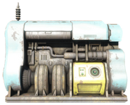


Finished Product:


Control Room Concept 29/11/2020
The Control Room is one of the most pivotal points in our game, it is the place that the player will discover the schematics before going to free the radio man and then the facility as a whole, of course before being stopped.
I drew inspiration from many different places, however in actual design it more closely resembles something from Star Wars.
My Inspiration:

The TARDIS interior design, more the large pillar-like beam in the middle inspired the control panels. 
The colour scheme was heavily inspired by the Death Star and other Imperial architecture from Star Wars, the greys and steels and blacks and whites. 
The shot and framing resembles a bridge of a Star Destroyer also from Star Wars, especially with the two pits in which the officers are stationed.
Final Product:


